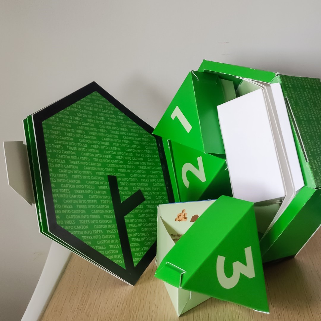
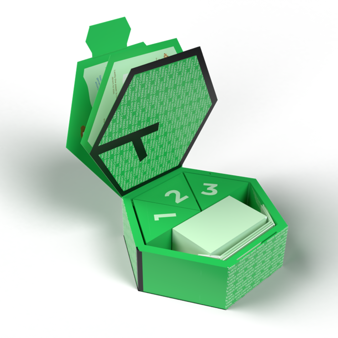
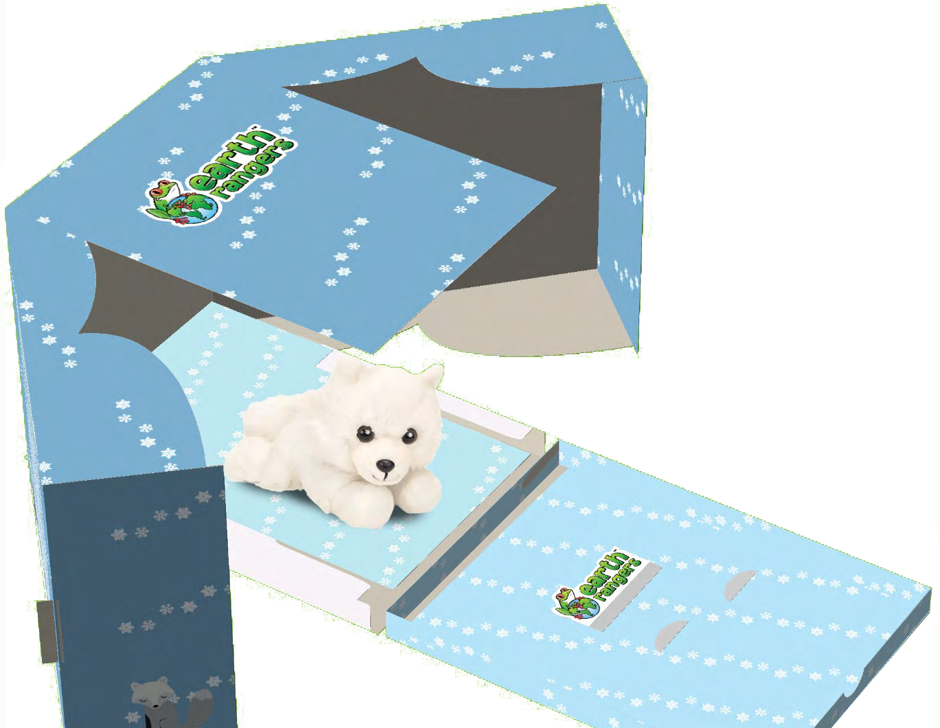
A benefit of the early pandemic days was having the time to focus on my team's entry to the PPA Student Design Challenge in 2020, leading to our first place win, making history as both the first finalist and champions of this competition in both Toronto MetU and Canadian history.
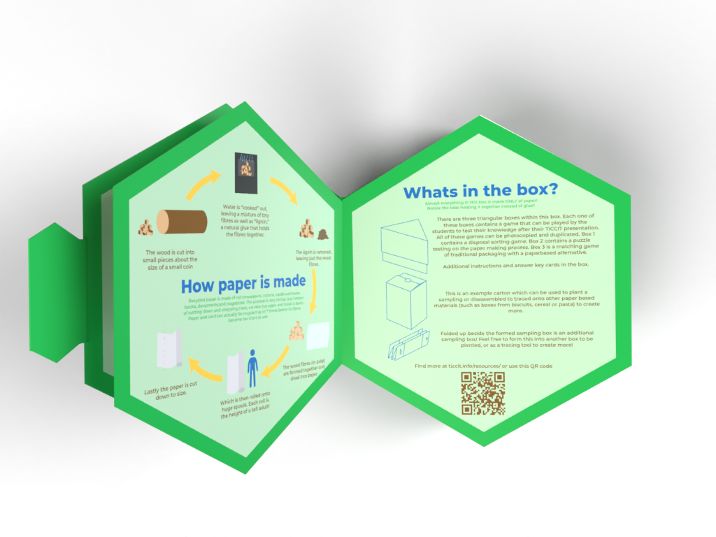
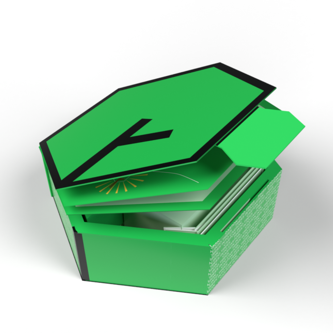
The Paperboard Packaging Alliance (PPA) is a joint initiative of the American Forest & Paper Association and the Paperboard Packaging Council. Their student design challenge for 2020 was to create an educational package for Trees Into Cartons, Cartons Into Trees (TICCIT), an outreach and educational program. The package was aimed at elementary school aged children, with educational content on the sustainability of paper and paperboard packaging, and to distribute the organization's paperboard tree planter.
With my focus on concept and structural design and my partner Laura’s strengths in graphic communications and marketing, we created this ready-to-ship toolkit. We approached this challenge with the intention to create something that initiates a positive learning experience for the educators receiving this product. We aimed for an intuitive design which was easy to navigate and exciting to unbox. Rather than focusing only on the visual aspects of the TICCIT packaging, we took a holistic approach and considered structural integrity, graphic manufacturing, user experience, effectiveness of communications, and sustainability using the breadths of technical expertise we learned in our major.
“What impressed me the most as a Packaging Professional was their tenacity and collaborative spirit. Working as a team, in many cases across time zones AND with limited tools, Dorotea and Laura created an impressive hexagonal carton that communicated a sustainability message that was both engaging and fun.”
- Sr. Director of Design, Food and Beverage Americas at WestRock
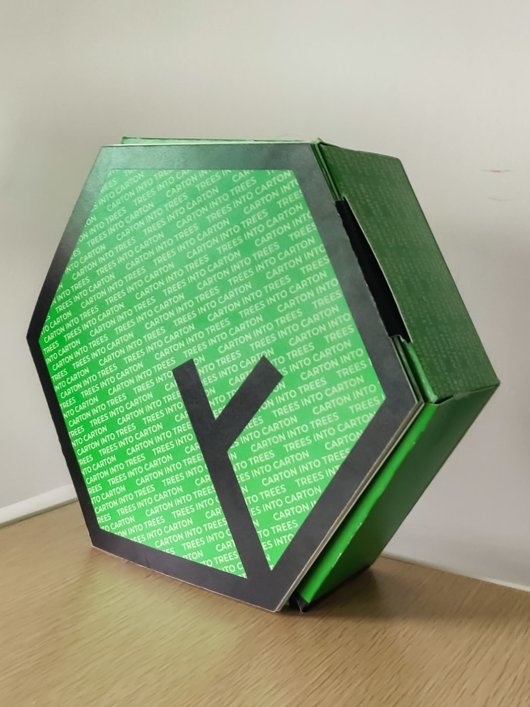
Following the accordion booklet of information, acting as a lid for this pack, is the main compartment. Designed
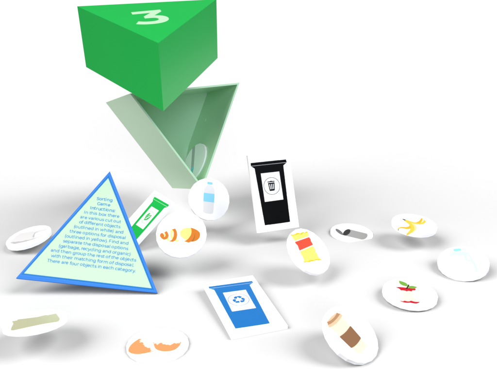
to feel like a treasure crate shaped in the brand’s logo, containing three smaller glue-less
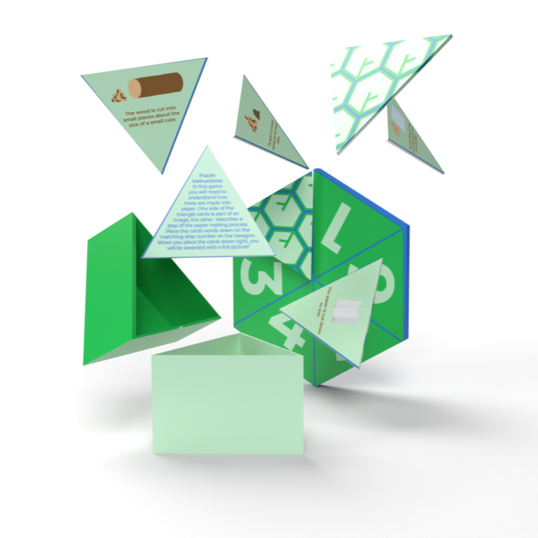
triangular boxes, an assembled sapling carton, and an additional unassembled
sampling carton. Within the triangular boxes we provided three unique and interactive
activities that keep 8-11 year old students learning and having fun.
Our design included single
sided printing to optimise production time and costs, glue-less structures to enhance
sustainability, entirely paperboard (including the games within which are easy to scan
and duplicate for the classroom) and ready to ship, using shipping labels to bind and
secure.
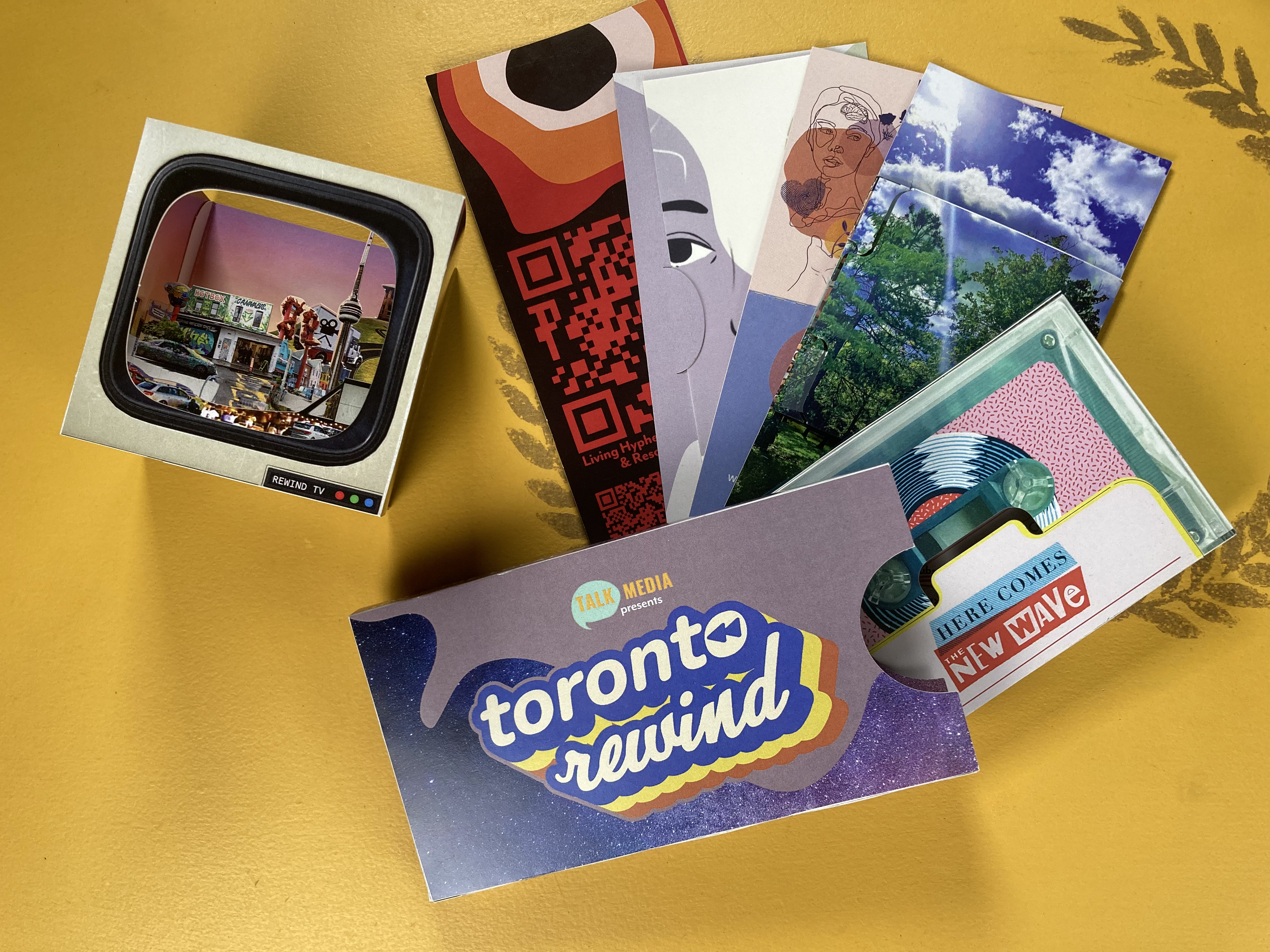
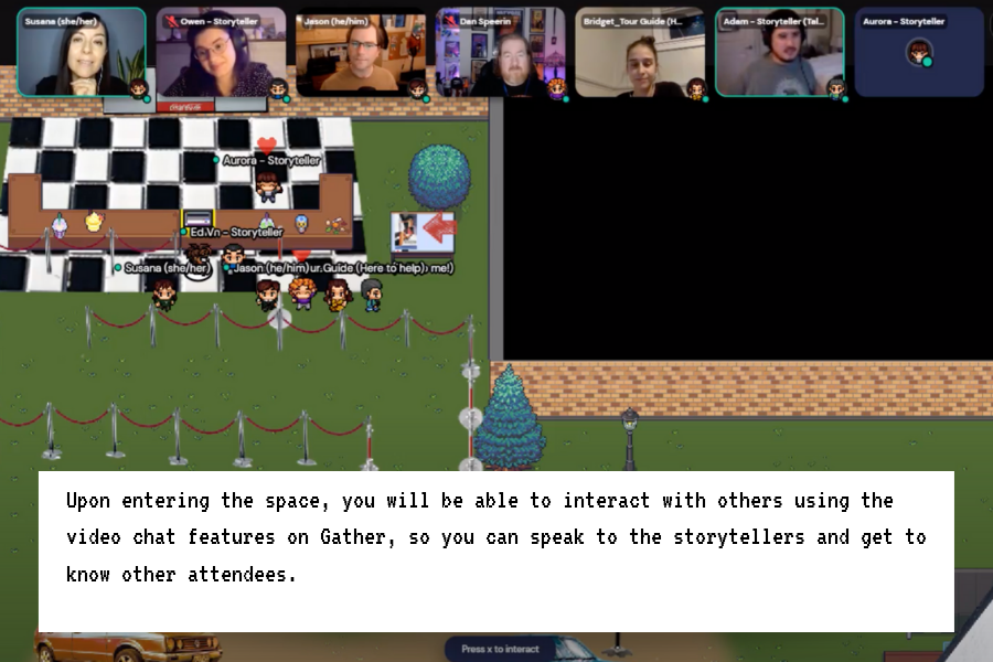
After completing my studies, I joined a local journalism startup as their “Packaging Extraordinaire”, taking on a multifaceted role that went beyond conventional design. My responsibilities included designing and producing physical components for a virtual storytelling event, offering UX guidance for enhanced accessibility to ensuring seamless integration of the technology in new storytelling experience.
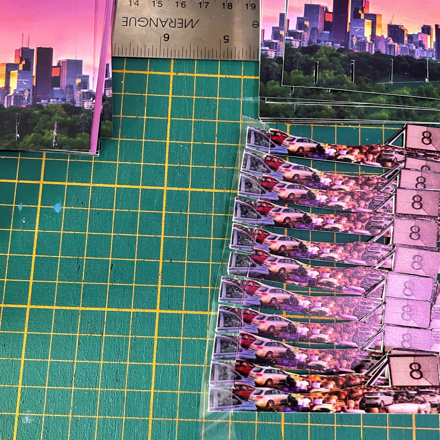
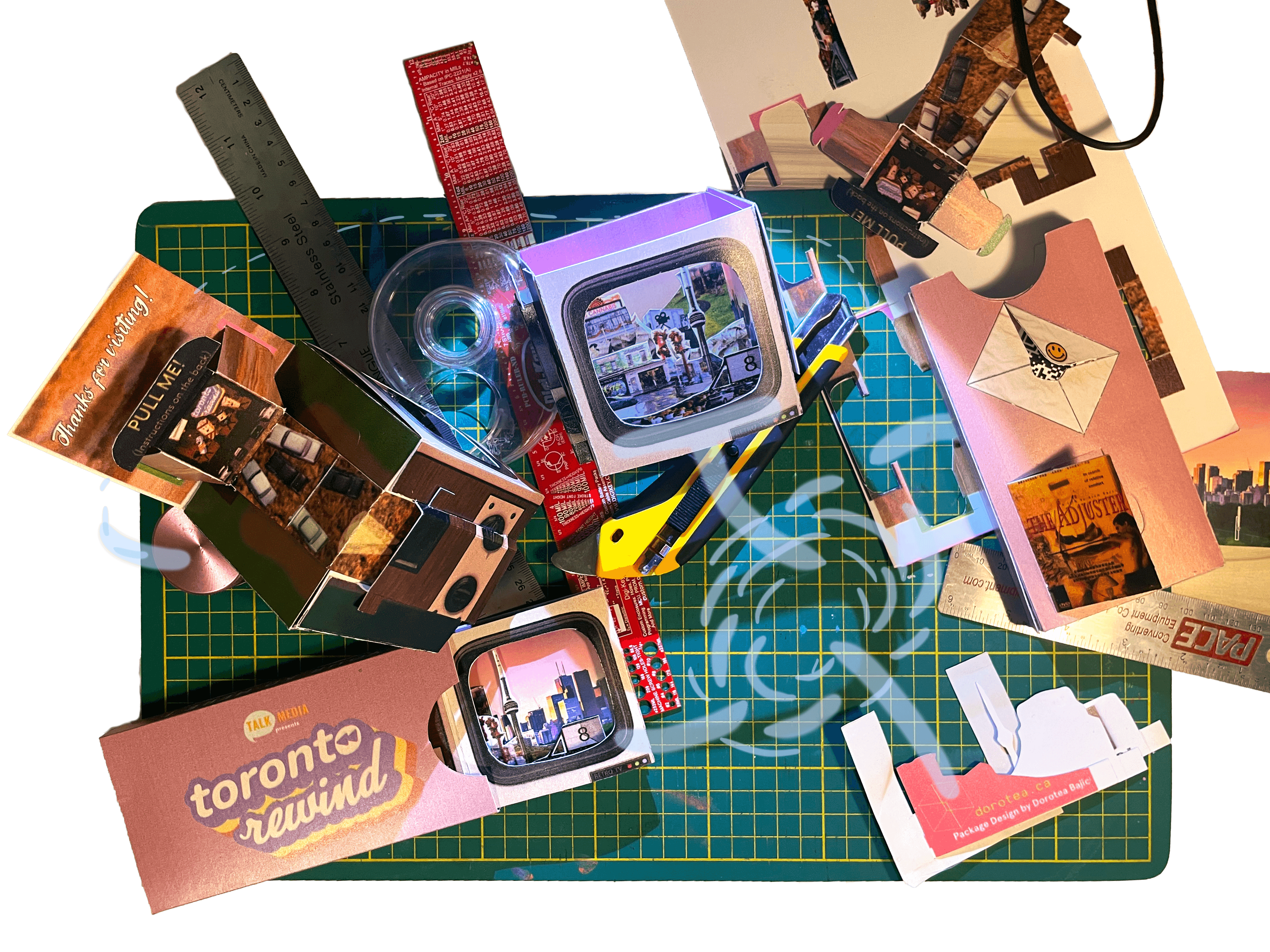
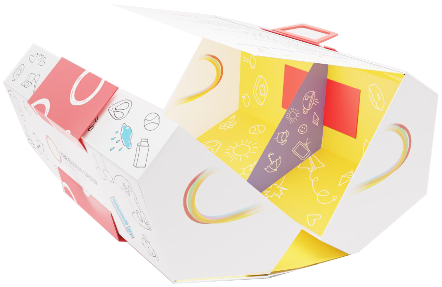
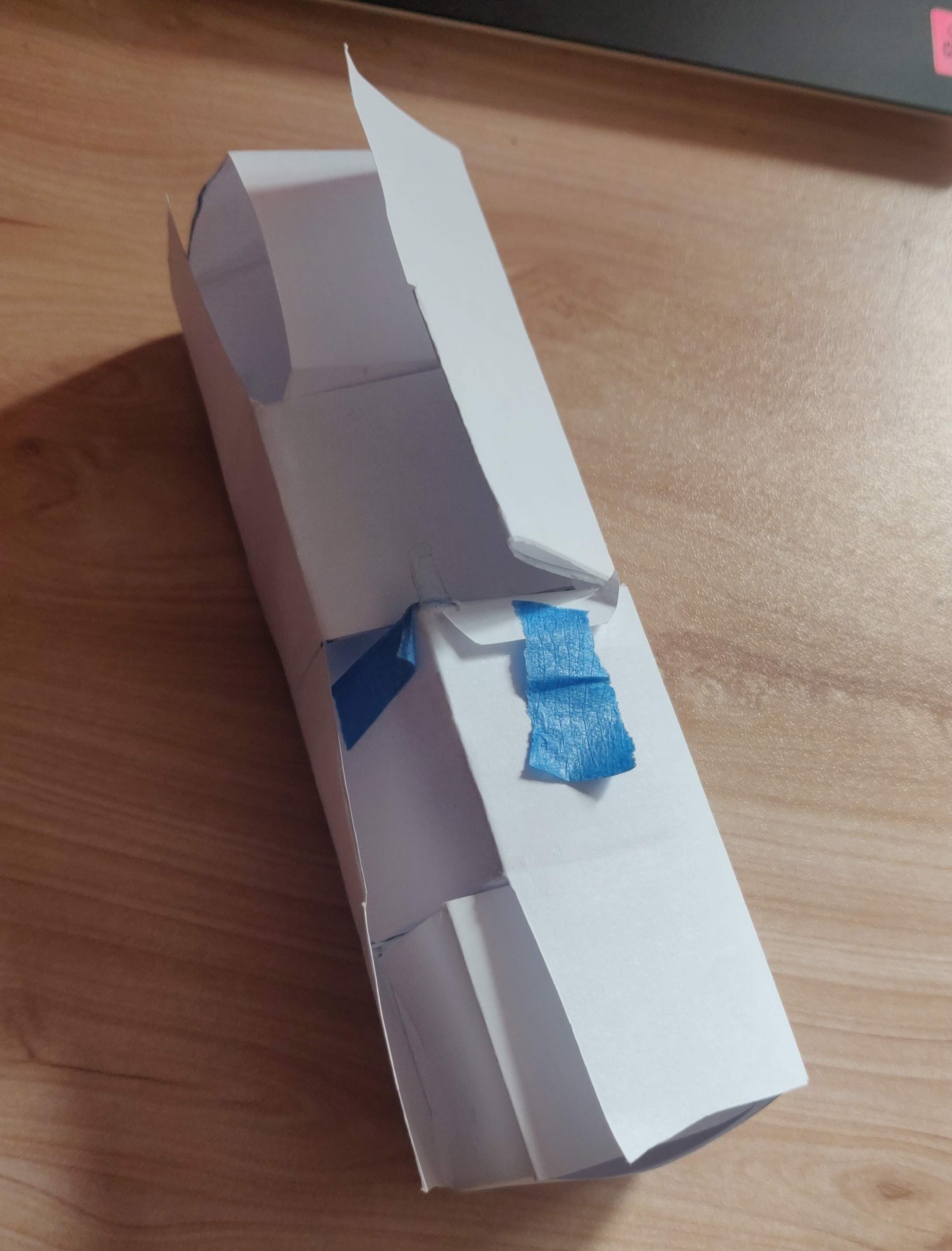
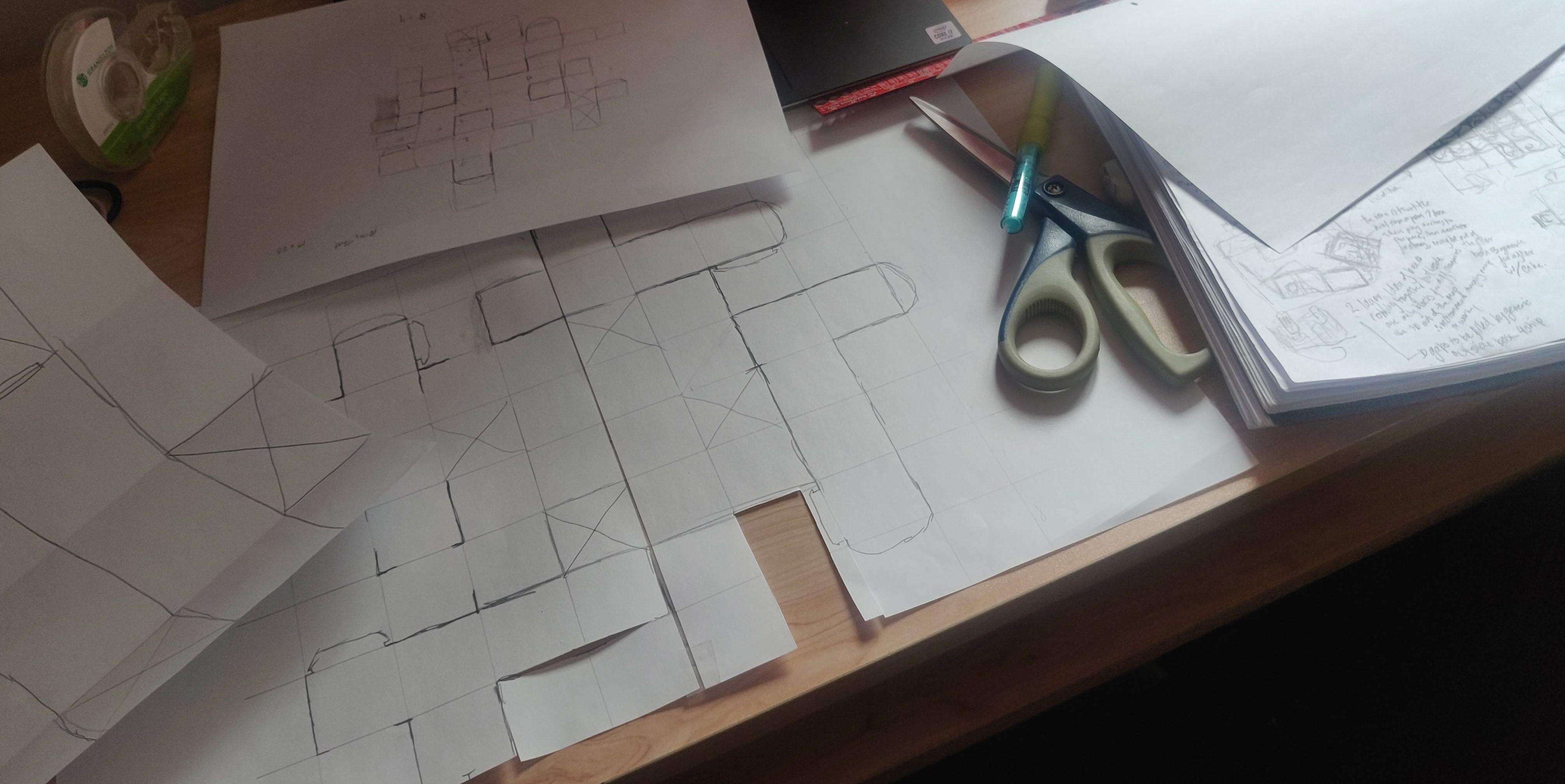
I was really excited to adapt the stories and virtual space elements into a physical form, adding to the adventure with reveals and tactile experiences. I started with rough prototypes using scrap paper. One of the features of the first version was a pull-out drive-in theatre that connects into a postcard landscape, turning the TV-pop up into a little sculpture. This was included for the trial event, which I made 30 copies for, printed using funds from a grant I was rewarded earlier that year and all cut by hand after a failed attempt to work with a local business which provided incorrect dimensions rendering our printed product unworkable by their machines.
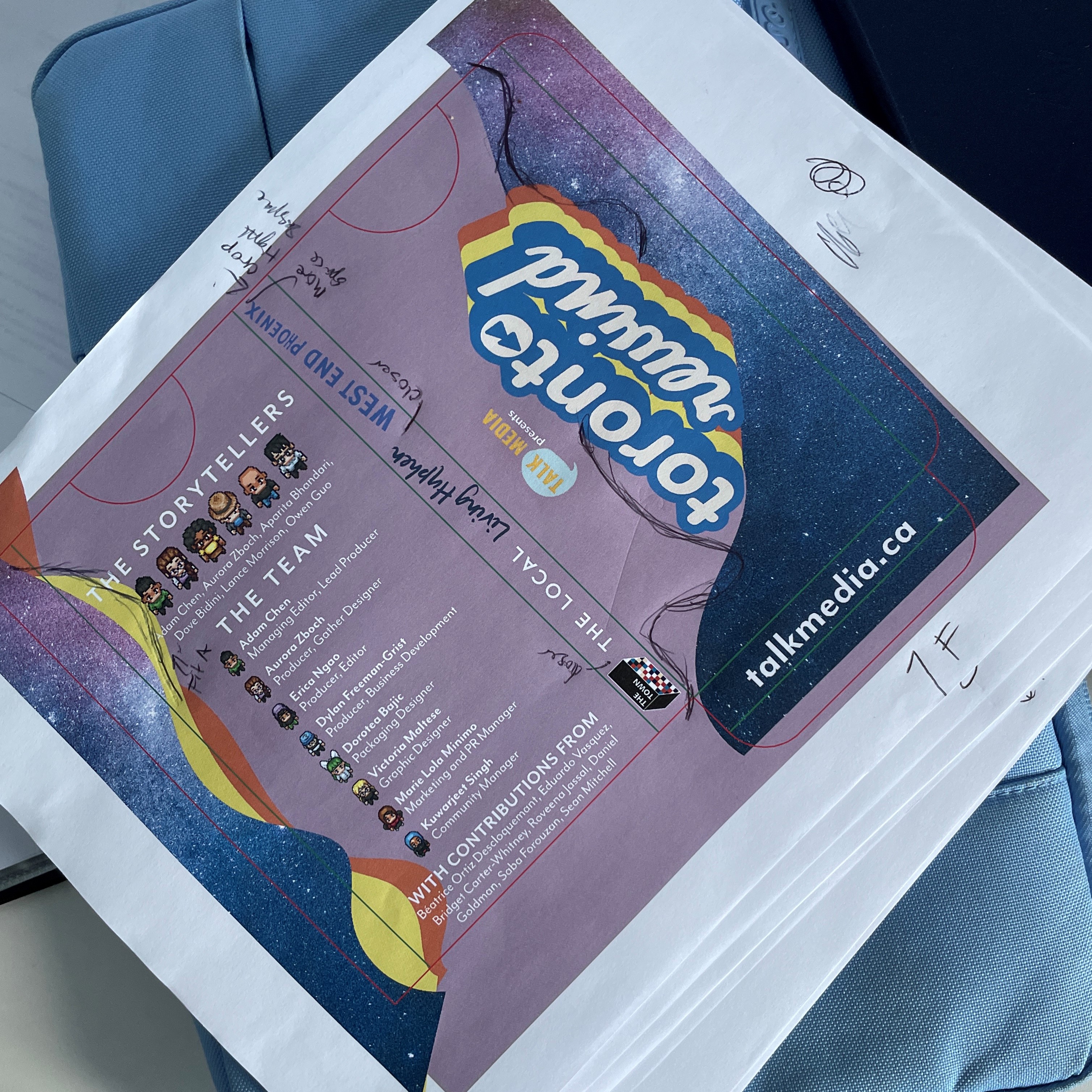
For the main event, we streamlined the design while introducing elements such as seed paper, pebbles, bookmarks, and concealed QR codes to add layers of interactivity. Everything fits nicely into a sleeve, designed to fit within the Canadian “lettermail” size limit to optimize shipping costs. I hunted for print & cut quotes across the region for this 10-piece design to further ensure low costs for the start-up. I orchestrated an efficient assembly line of teammates, ensuring timely product delivery to our attendees.
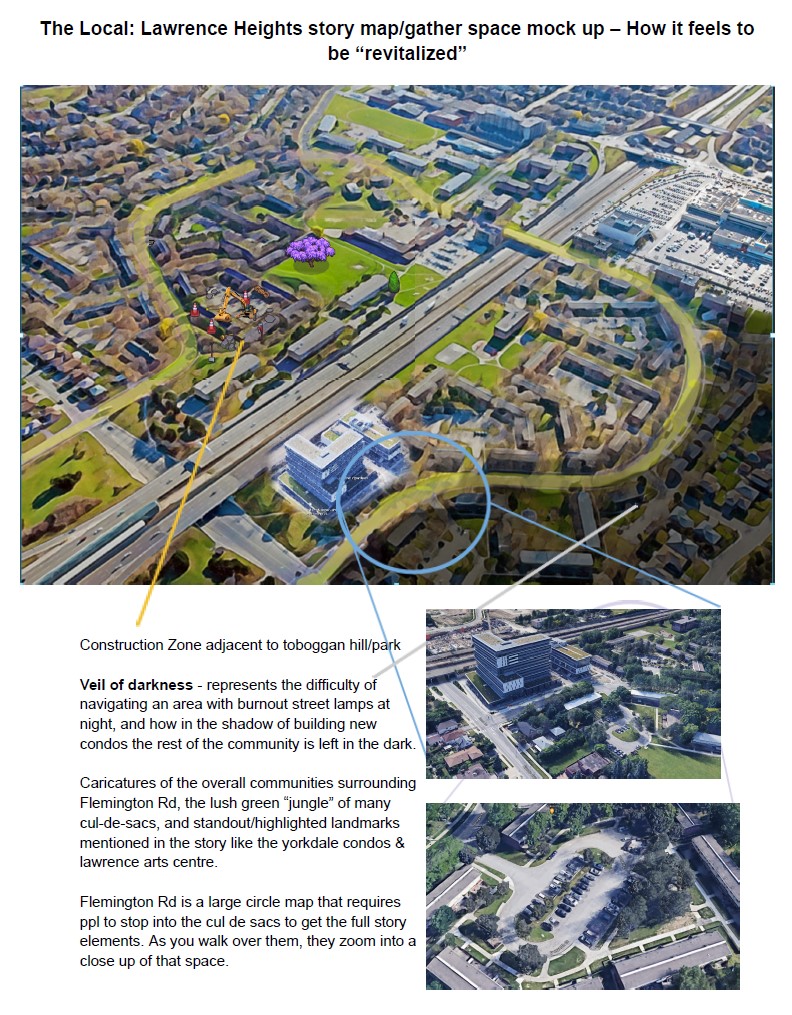
My favourite part of this design is the pop-up scene within the TV, compiling aspects from all stories in the event. I also love how colourful the entire pack is, enticing to explore. As an added easter egg to the storytelling event, I turned the process of making the package into a virtual maze of its own. Other contributions were made in the concept and creation for the Lawrence Heights neighborhood virtual story space
Seizing an opportunity to work with a journalism start-up, unleashing limitless creativity into a packaging complement for a live storytelling virtual event. Overcoming initial production challenges of the 10pcs design for the trial event, I applied learnings to ensure an efficient process for the main event involving 500 copies, maintaining the exciting unboxing experience.
I am so proud to have been a part of this journalism start-up in its unique opportunity to support the creation of their virtual event which would
take participants through a digital space with interactive elements engaging all senses and realms of thought. While my main
responsibility was relaying this layered experience
into a physical packaging-adjacent component, I also supported with ideation and testing the virtual spaces to ensure participant satisfaction.
Global News TV Clip
When I discovered that structural packaging design was my calling, I had imagined myself working in a role with as much accessibility to experience and learn about the depths of the paper packaging industry, opportunities to apply new innovations or to curate solutions for each customer, and the environment to explore creative possibilities as this role offered.
Being the first designer at the Ajax facility, it made everyday feel like new ground as I developed the facility to serve design needs. I worked remotely alongside my food and beverage teams based across the USA, and was the sole designer on both due to my production location functioning in both, the consistent exposure of which granted me an advantageous understanding of manufacturing.
I was lucky to also travel in this role to other plants and offices, trade shows and customer site experiences, gaining valuable insights into the nuances of the paper packaging industry. From types of board structures and testing for all climates, considerations for high-speed automation and efficiency optimizations I was sure to inquire about often to learn all the tricks which contributed to the prime positioning of WestRock.
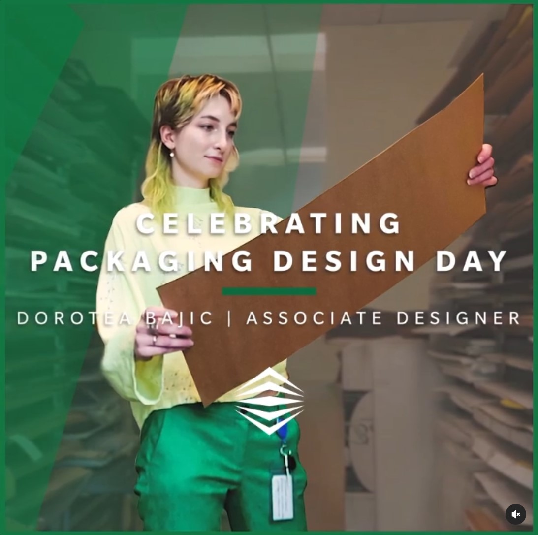
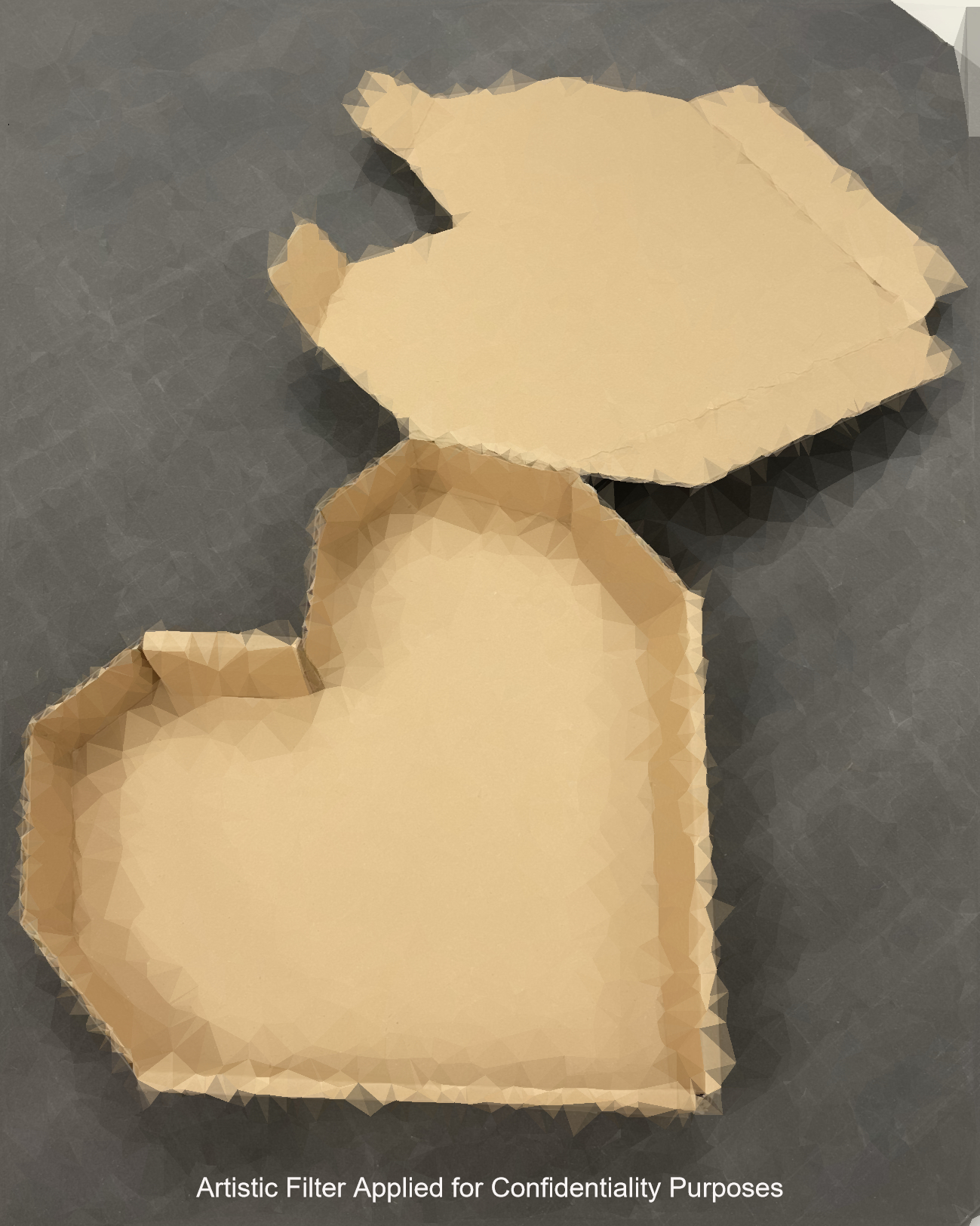
One of the first noteworthy projects I worked on was the Krispy Kreme Valentines Carton, featuring a large heart window with detachable smaller hearts doubling as Valentines cards without compromising product quality or materials. You can see it featured in a Dieline article here. The focus of specialised cuts to ease removal of the heart cards led to nomination for an industry award. Setting the stage for further recognition in subsequent innovations including patent considerations and in 2022, the honour of being the Employee Spotlight for Packaging Design Day.
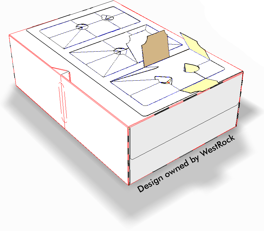
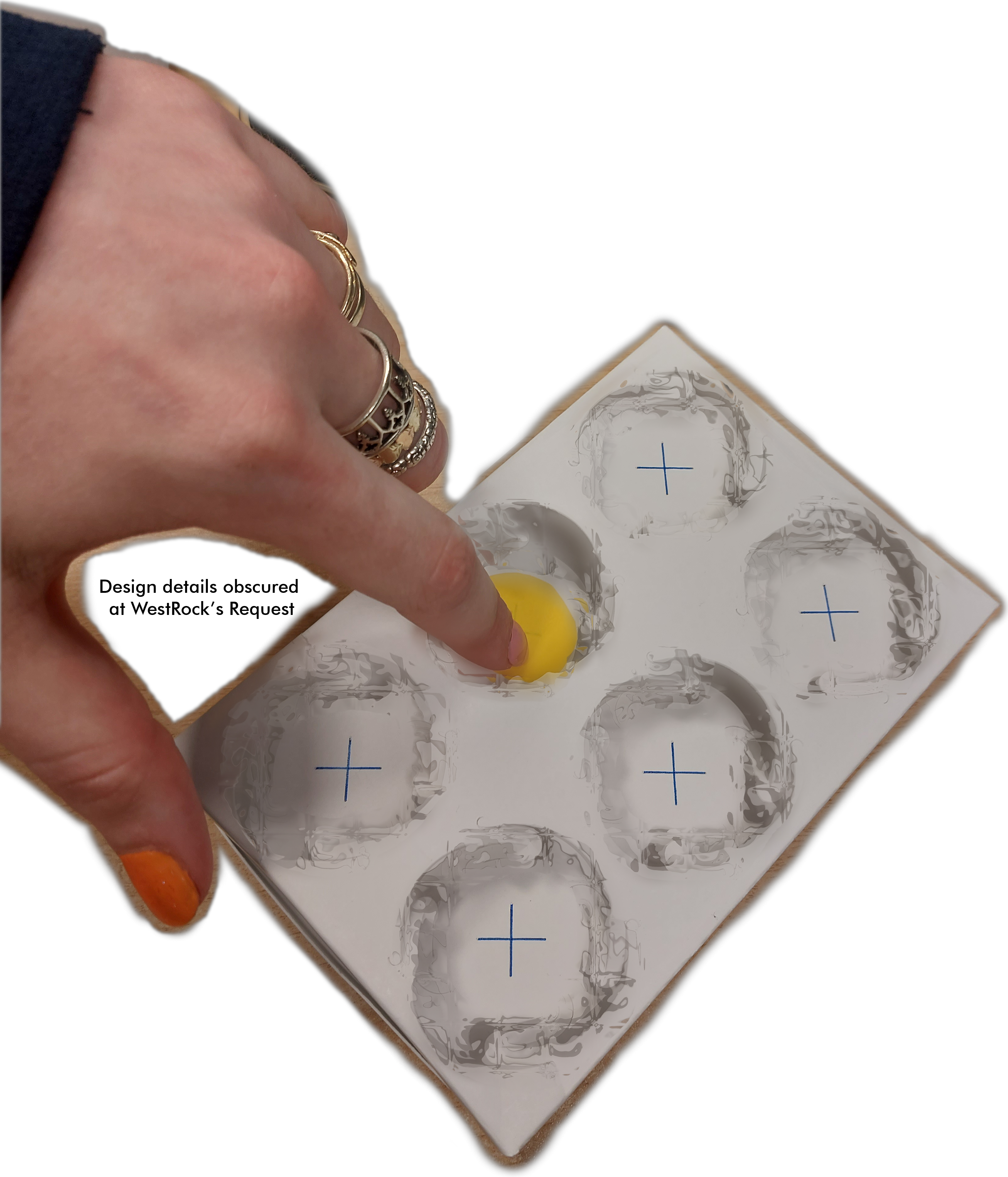
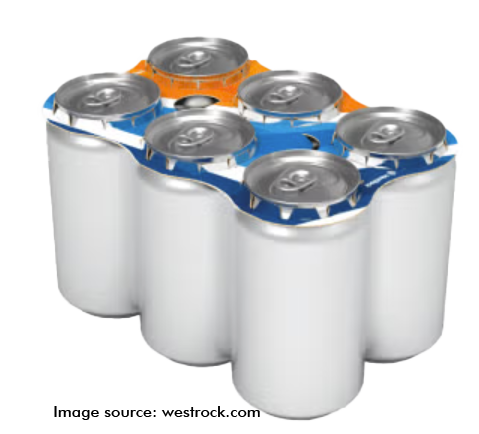
More recently, I tackled the design of a fully enclosed 24-can pack, incorporating a graphic advent calendar with a 5th panel. This design leveraged production capabilities to maximize design possibilities while maintaining print production and automation efficiency. The design prioritised efficiency through a no-strip and limited glue approach, with adjustments to minimize impact on filling speeds.
Significant projects worked on:
Paper bakery solutions for Costco Canada, Krispy Kreme, Dairy Queen, Walmart, Publix and Carolina Foods, and other customers
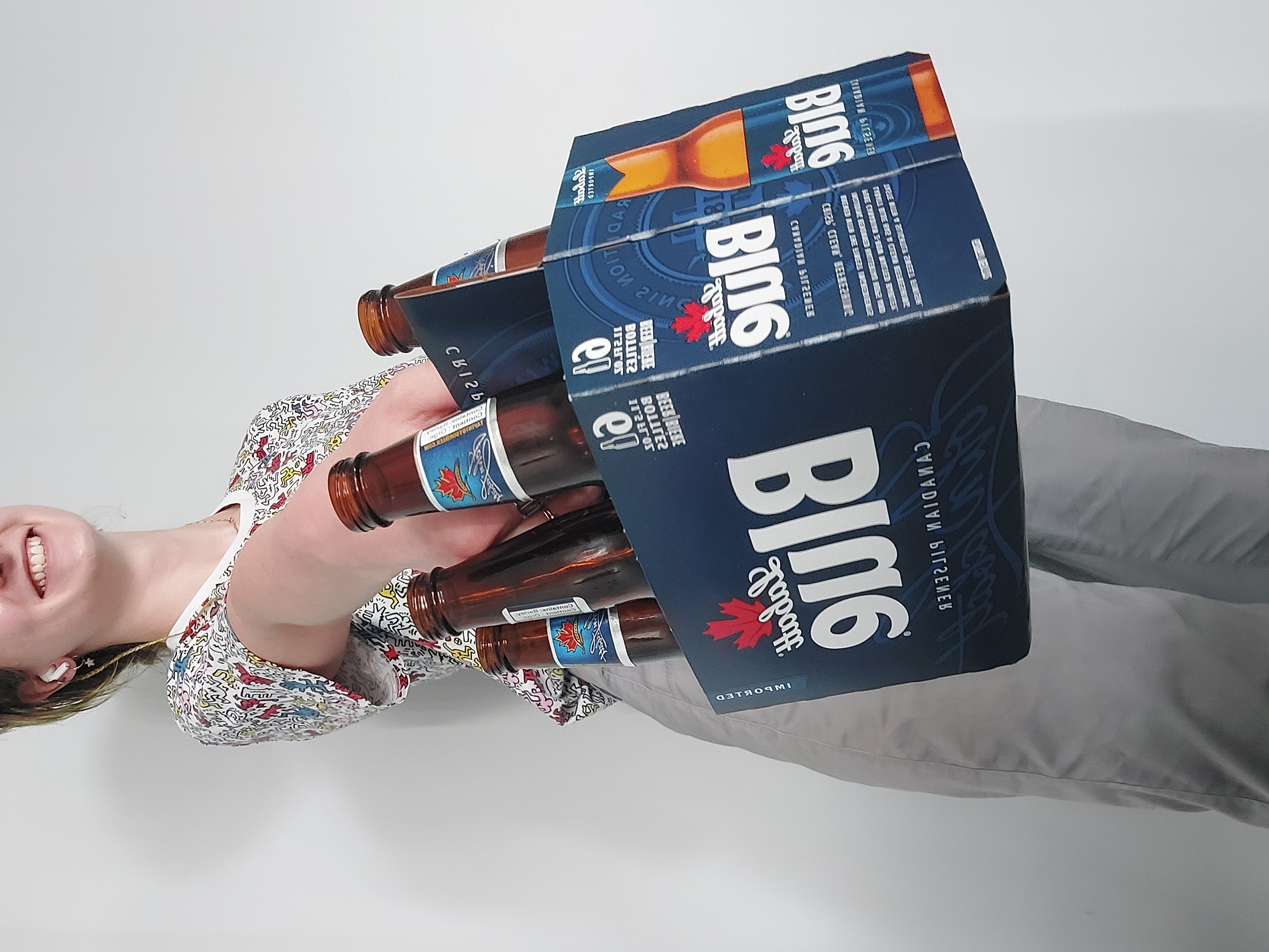
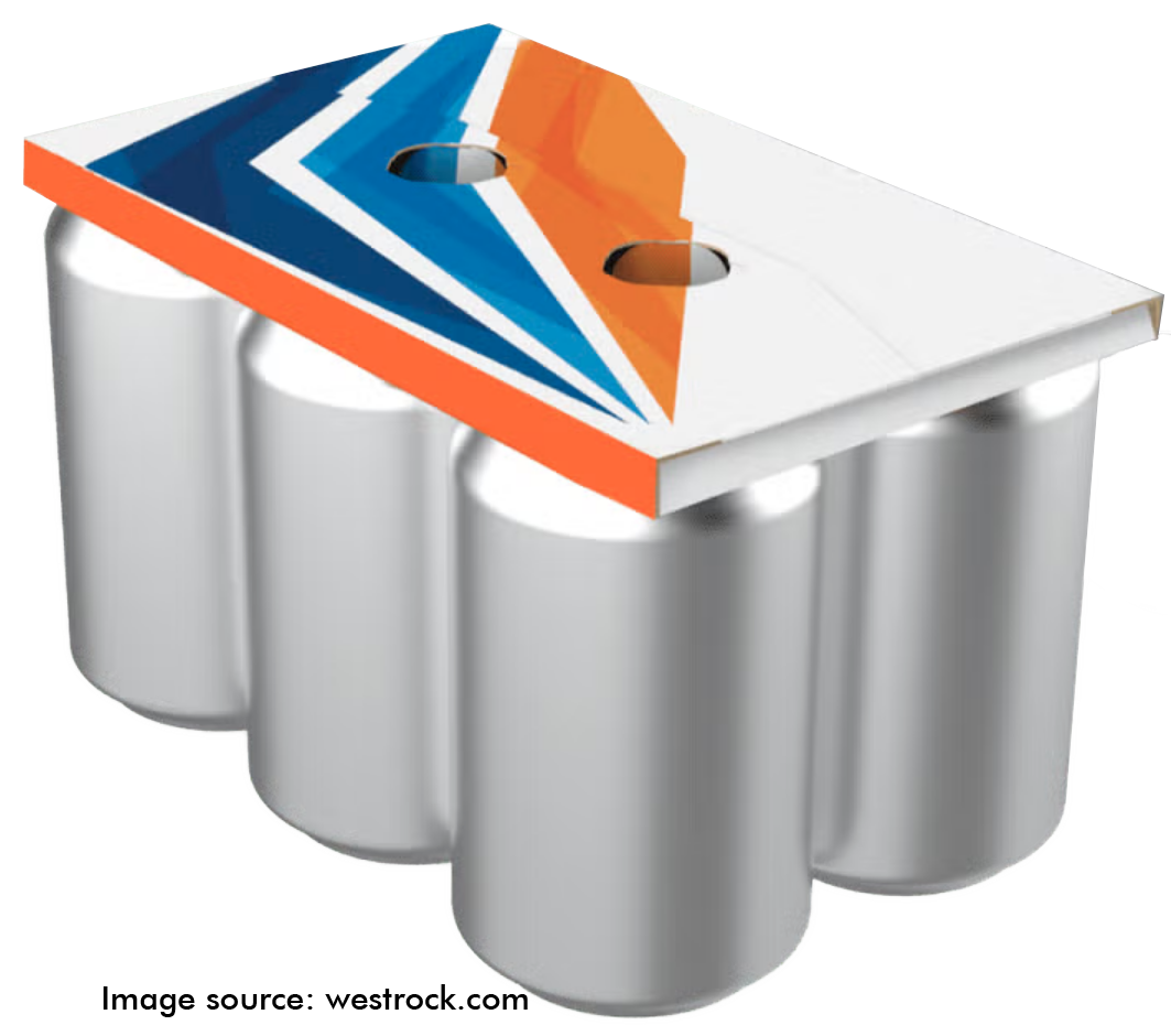
Varied take-out-plastic opportunities with clips, wraps and fully enclosed cartons for Coca-Cola, ABinBev, Molson Beverages, RedBull, Arizona, Carlsberg and more
Production trials and testing of can paper clips with brands such as ABinBev & Pepsi
Multipack folding carton solutions for Campbell’s Snacks, UTZ Snacks and Kelloggs
Assorted food service including formed cartons for Whataburger, Virtual Dining Concepts on Mariah Carey and MR.Beast projects, CMI, and others
Coming out of university, I was so happy to find myself in a role which supported the replacement of plastic solutions and also gave me access to the wide breadths of the industry. The role was built for me at a facility close to where I was already living, I essentially built up my lab from scratch as their first on-site designer. It was an honour to work with a diverse range of customers, tailoring solutions and being creative in finding innovations within existing systems. This experience enriched my knowledge in automation, design development, production & testing equipment, industry intricacies and project management.
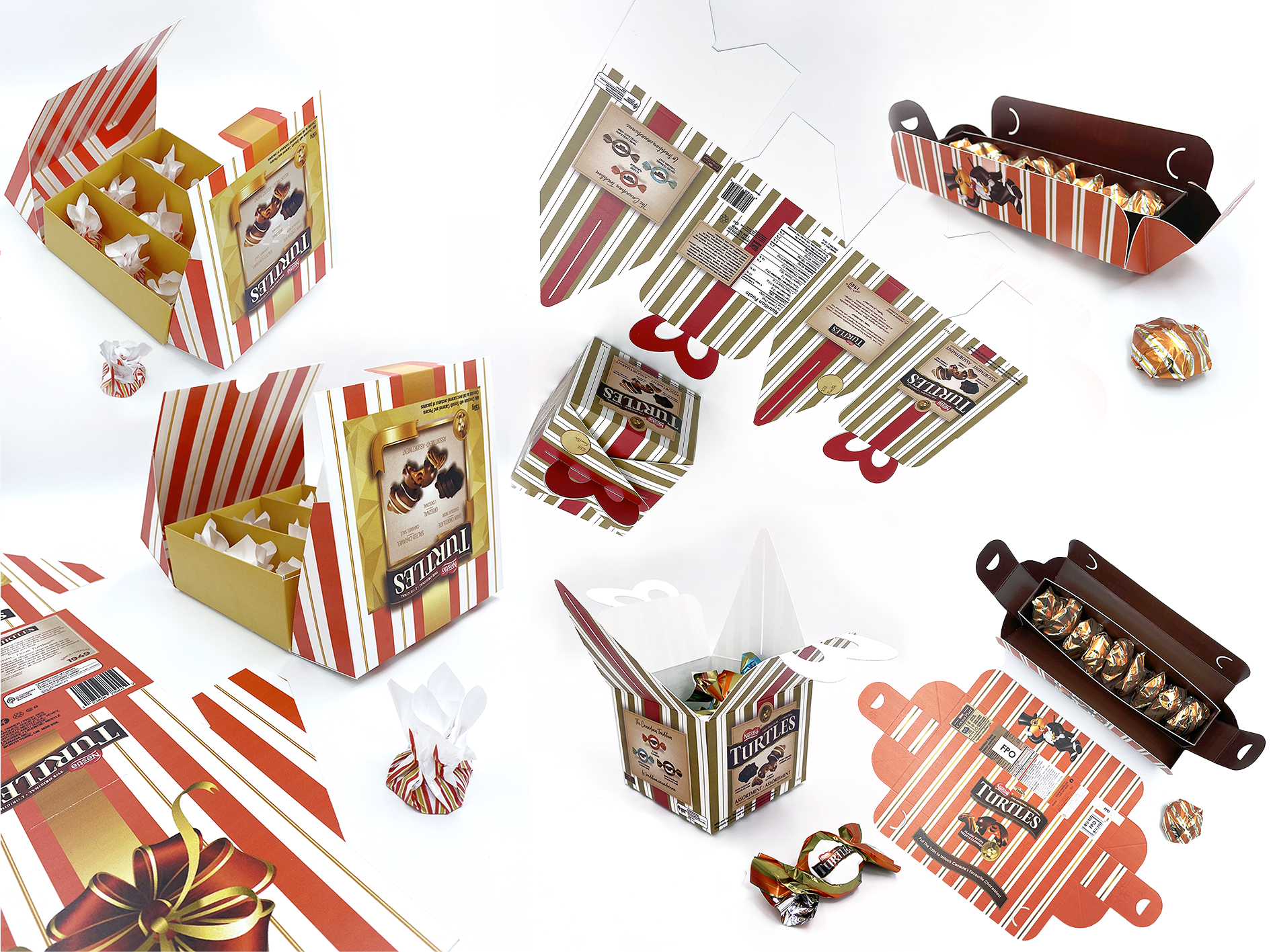
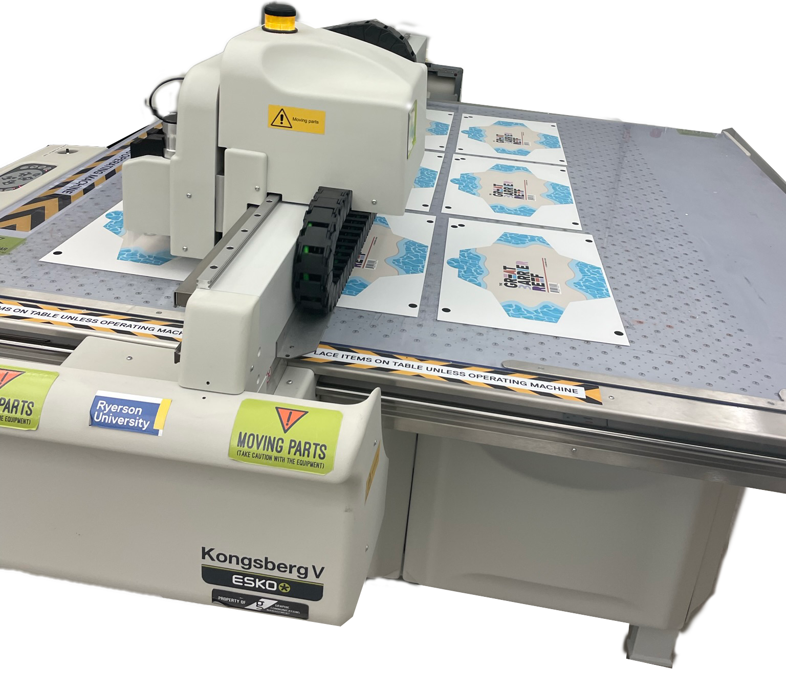
During the last semester of my undergrad I had the opportunity to work with Donna Razik, a professor of mine, to launch a competition in collaboration with Nestle Turtles to take place in-line with teaching students about package prototyping. Pictured on the left are the finalists from the class, it was a pleasure to help students make their visions tangible and provide feedback on techniques or concepts. The new Richoh flatbed UV printer and Formech vacuum former at TorontoMU’s Design + Technology LAB (Formerly Ryerson’s Creative Technology Lab) has allowed us to explore new methods of high and low fidelity prototyping.
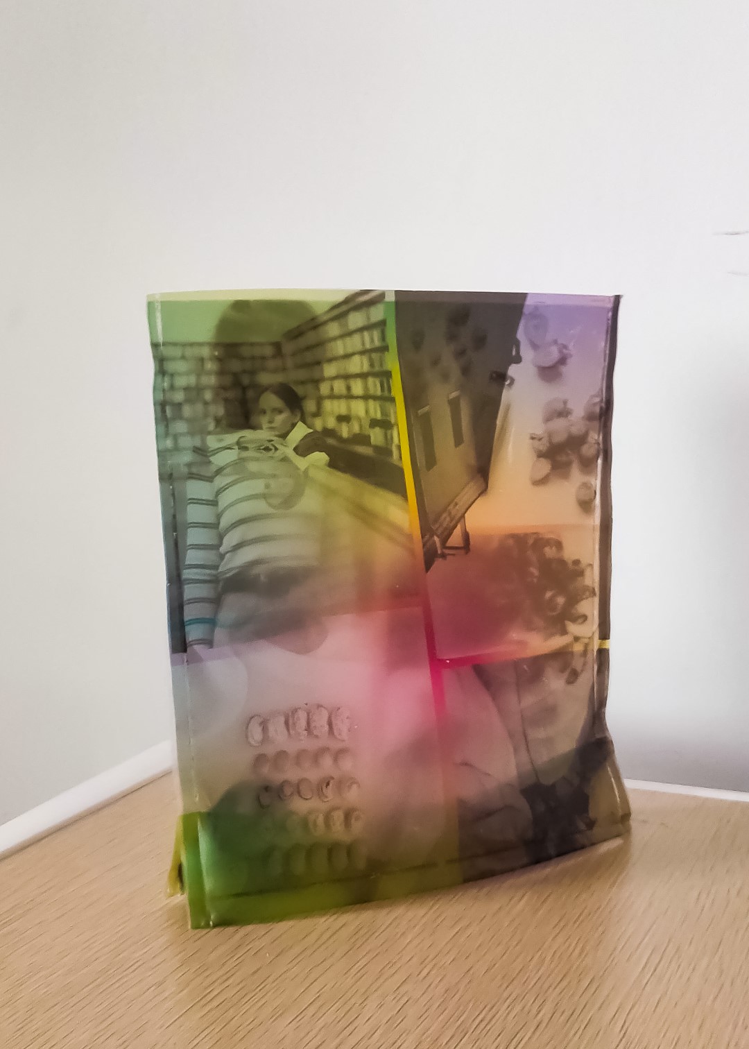
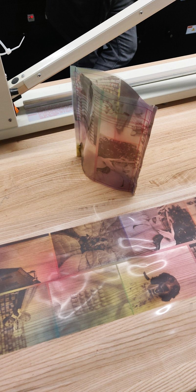
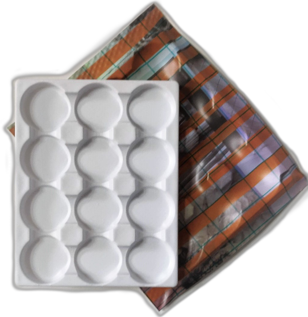
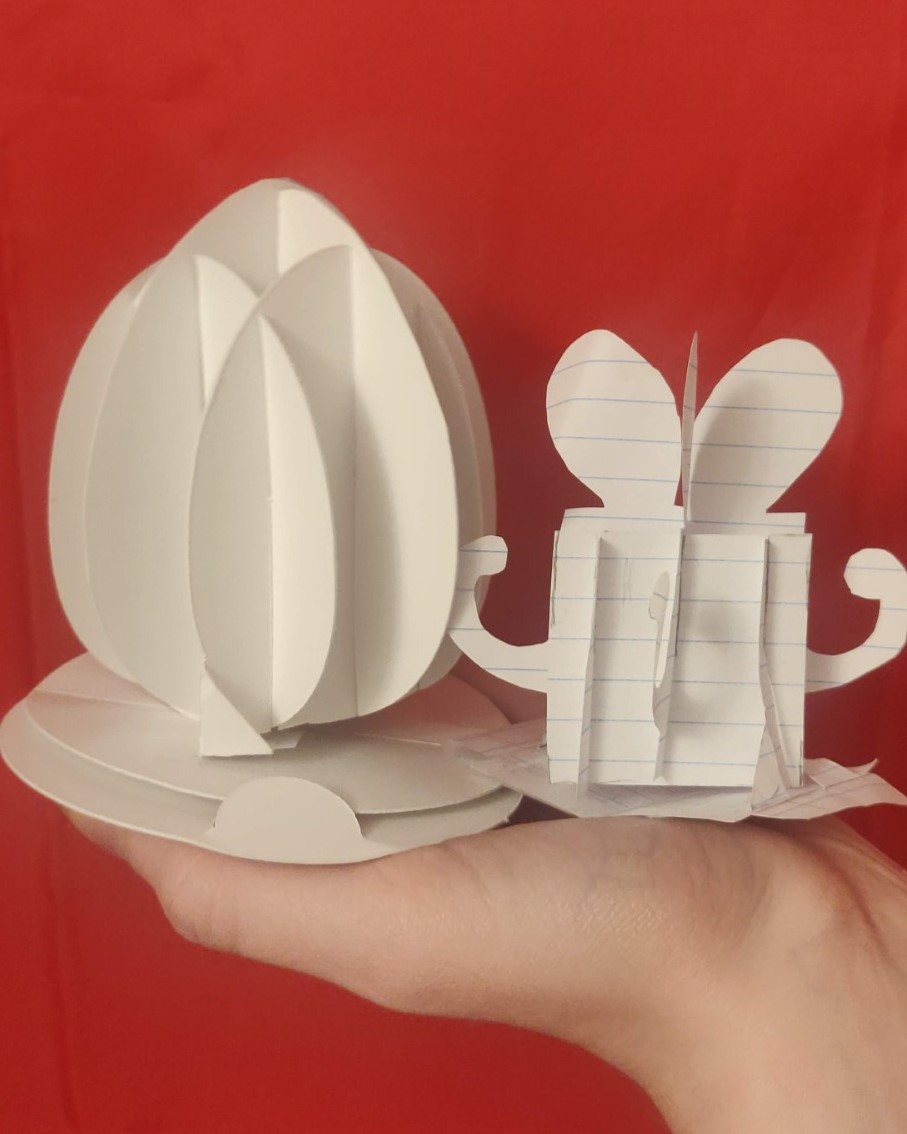
In our tests we were able to create prototypes of printed pouches with the option of adding a zipper, vacuum formed trays, and overwrap packaging using 3D printed food product replicas. These explorations have influenced me to continue this research in prototyping with my DFZxCTL grant where I created the low fidelity pop up egg and gift pictured and instead of using the remainder to continue researching graphic displacement in vacuum forming, I applied it to produce the trial event packaging for the start-up project you just saw above this section.
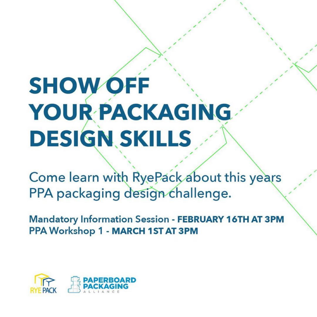
I continued my passion of sharing packaging knowledge in my role as VP of Competitions in TorontoMU’s student packaging group in my final year. I had the opportunity to facilitate packaging competitions for fellow GCM students including the Corrugami Logo Challenge, Egg Drop, and the PPA Student Design Challenge for 2021. Throughout these I have hosted workshops and 1-on-1 meetings to mentor the students, propel their ideas and guide them through the creation and competition process.
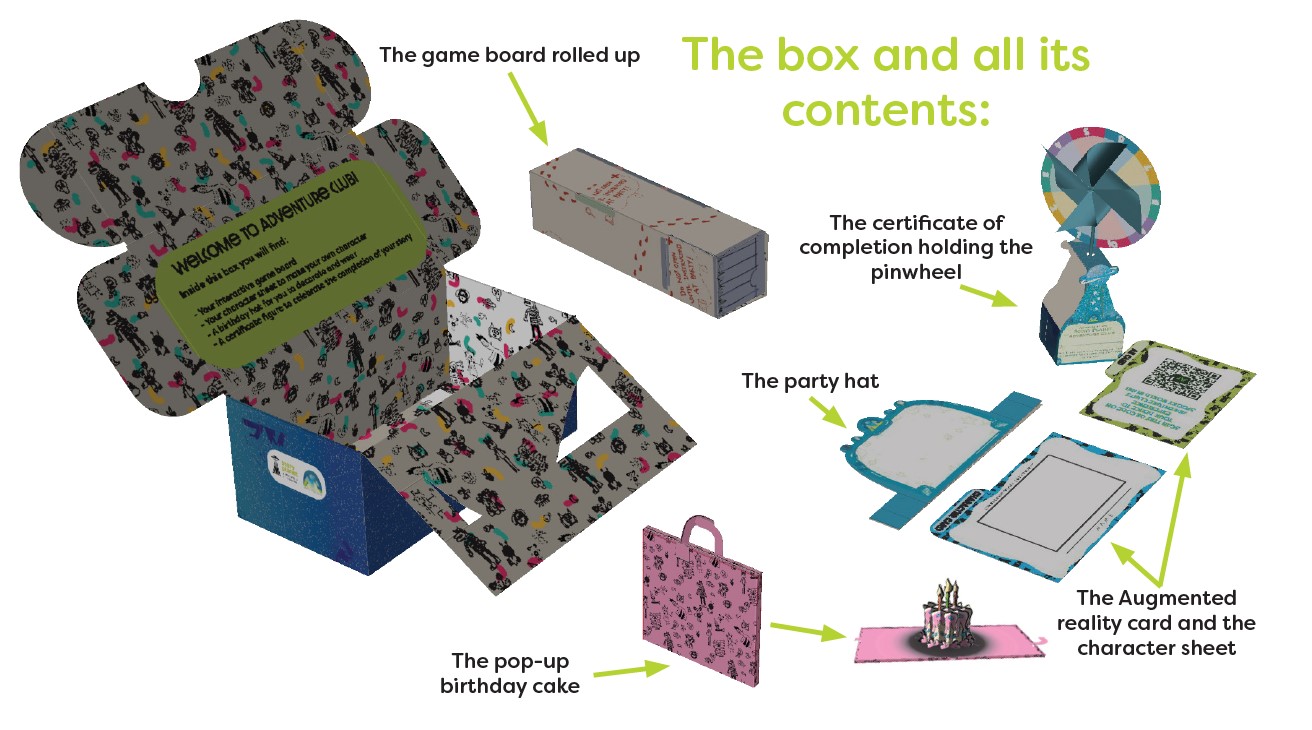
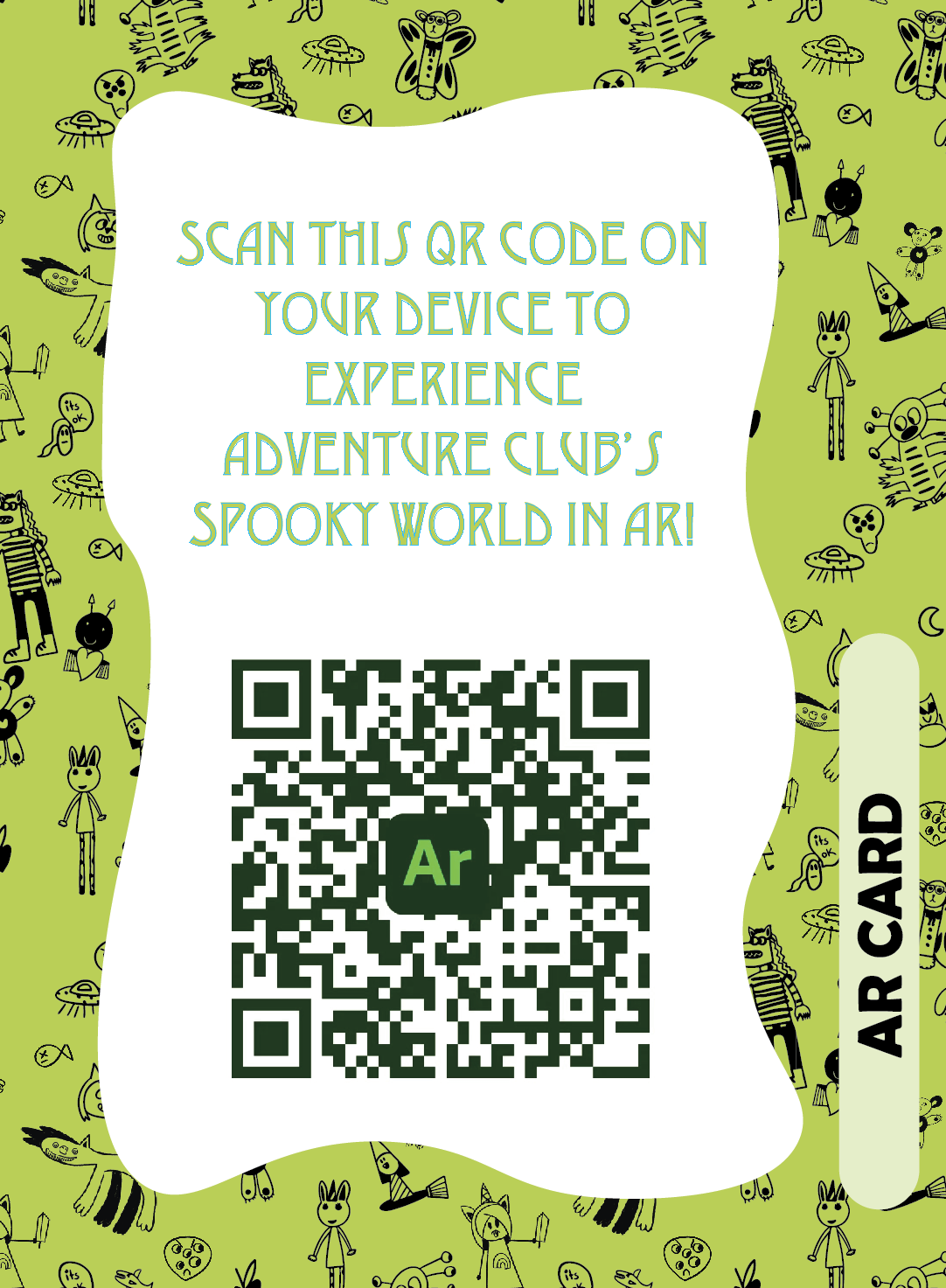
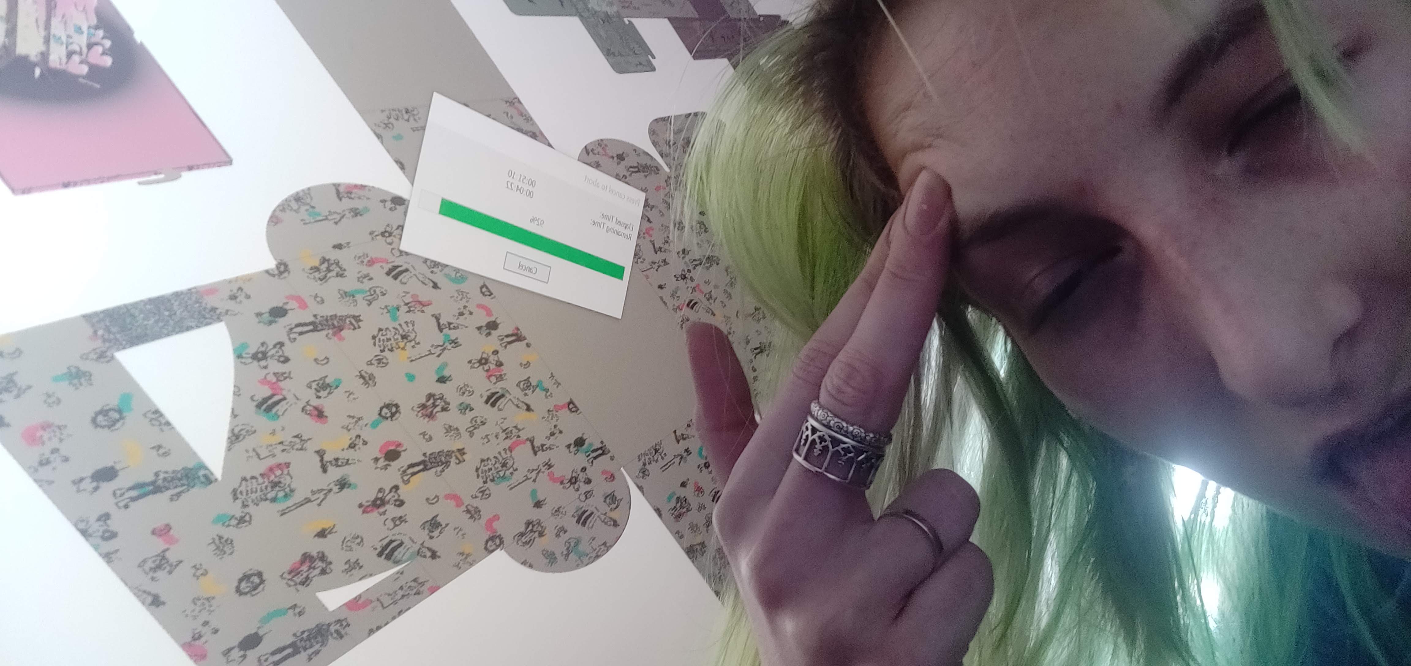
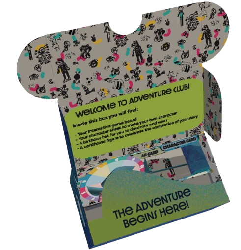
Having won the entire competition in the previous year, big shoes to fill in, I wanted to push myself for the following year's entry, becoming dedicated to including an Augmented Reality component. The prompt was to partner with a charitable organisation and create a packaging concept to support their mission. A junior student joined our duo making us a trio, with intentions to impart our skills and also support workload as we were busy in the final year of our studies. We partnered with a local non-profit organisation dedicated to amplifying the voices of children by inspiring their imagination,building critical literacy and communication skills. During the pandemic they started hosting virtual birthday parties with a Dungeons & Dragons story building format for which we designed a physical packaging component for.
Assisted with the implementation of in-class packaging competition which was a partnership between Nestle Turtles and GCM 808: Packaging Prototyping. In this I created course materials, tutorials, conducted feedback and idea development meetings with students and output all prototypes on campus. In addition we created new prototypes for pouches and overwrap solutions and methods of creating them to offer alternative packaging designs for the students to use.
I was lucky to obtain this grant to further explore the possibilities with prototyping with access to the CTLxDFZ resources. I started with trialing pop-up paper structures, my intention was to expand my understanding on how we can make the 2D materials 3D, which turned into exploring the displacement of printed graphics when vacuum forming. In the end, I used a majority of the funds to support the journalism start up I was a part of so that we could affordably produce my intricate paper design for the trial event.
Being the VP of Competitions at TorontoMU's Packaging student group has given me the opportunity to facilitate packaging competitions for GCM students including Corrugami Logo Challenge, Egg Drop, PPA Student Design Challenge 2021 and initializing plans for an internal competition. Throughout the year I have hosted workshops and 1-on-1 meetings to help develop the students skills and their competition entries.
Determined to try new technologies and techniques to exceed the capabilities demonstrated when we won the year prior, I taught myself how to draw, render and animate in ArtiosCAD, how to design pop-up structures as well as creating Augmented Reality experiences via Adobe Aero. To enhance the educational value and handle the intricacies of our ambitious glue-less design, we welcomed a mentee to our team, enriching our collaborative effort to deliver our full vision.
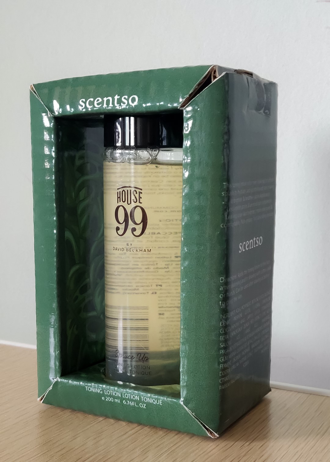
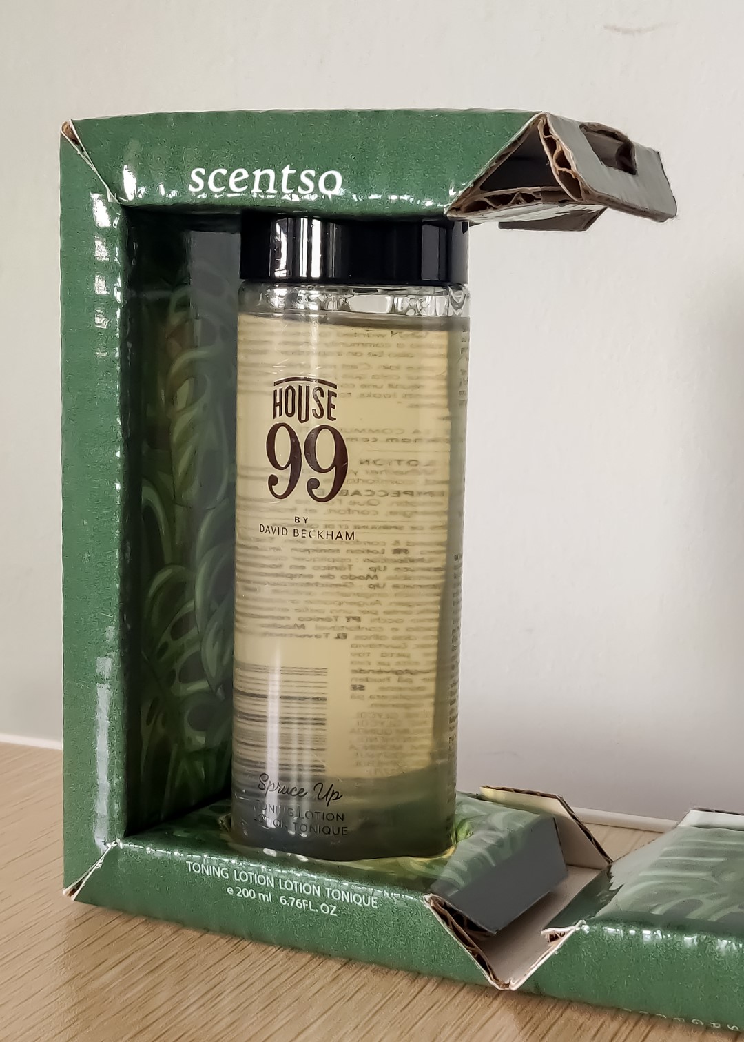
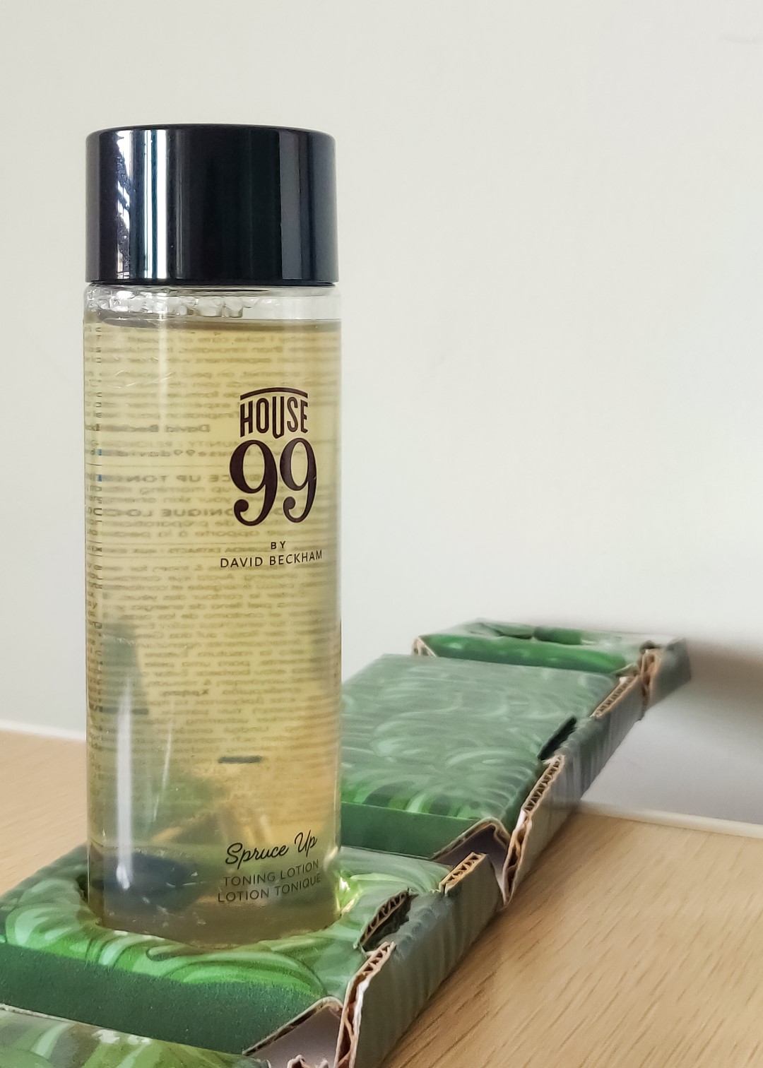
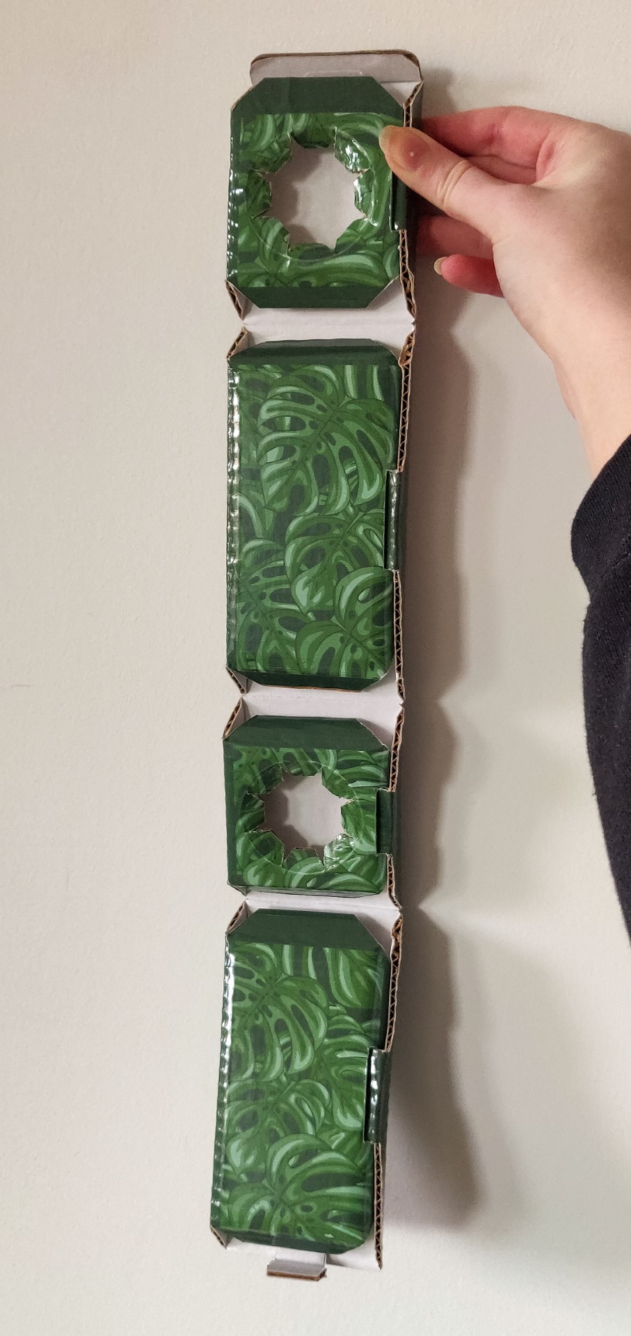
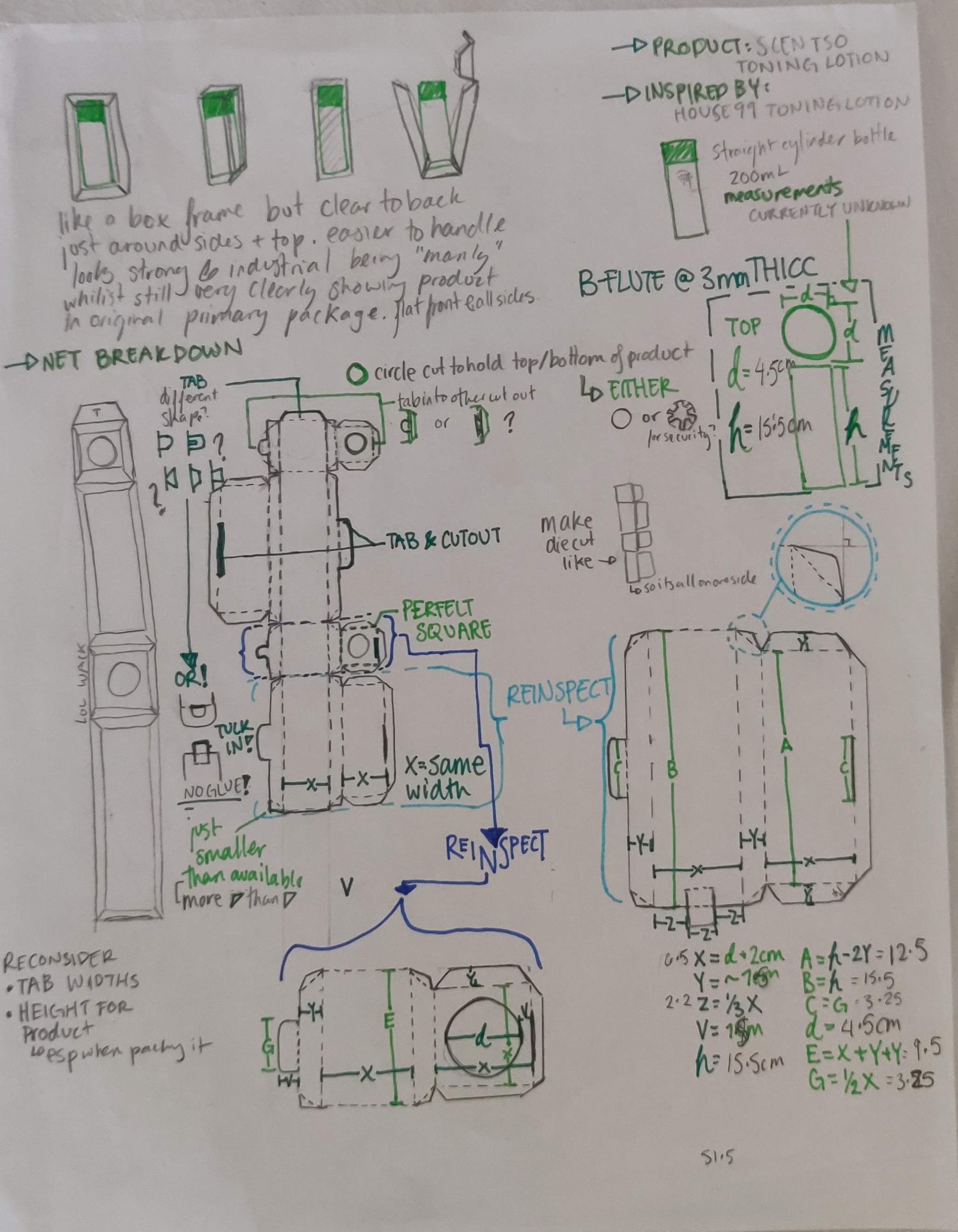
Through coursework as a student in the Packaging Prototyping course I created this structurally glue-less corrugate frame prototype for Scentso, a fictional mens cosmetics brand. For the prototype there is adhesive to adhere the printed vinyl layer, which was once the only method available for printed prototypes on campus. This was intended to be ready-to-ship, using the shipping label to secure where the wrap connects with itself.
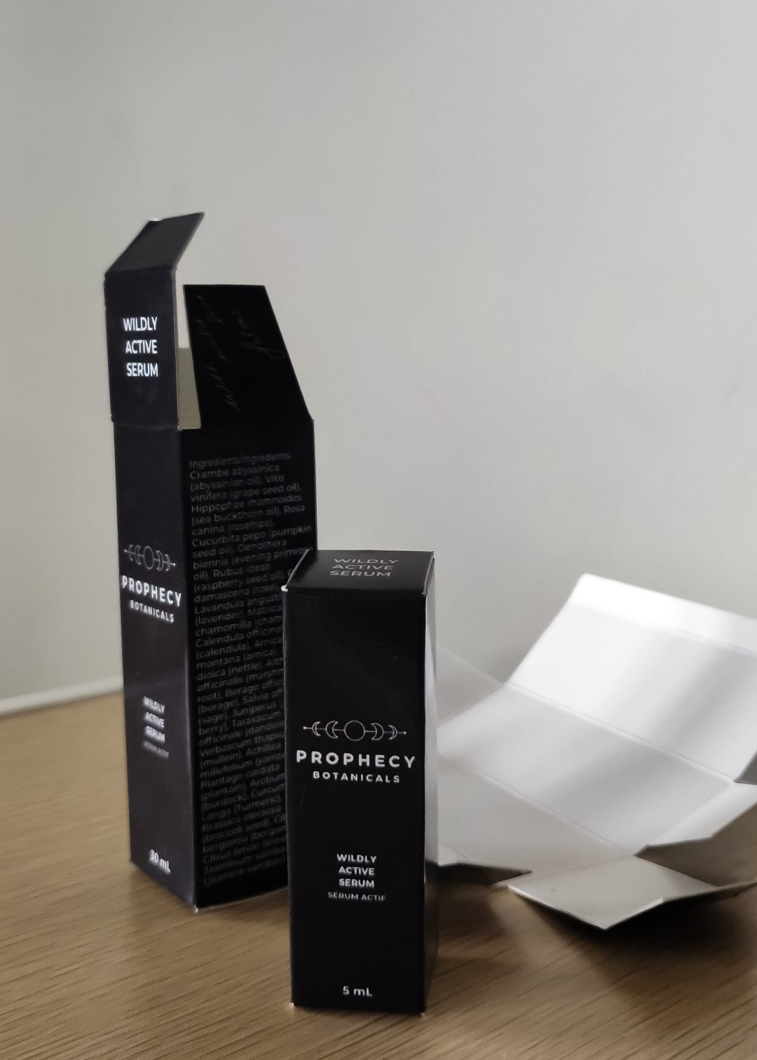
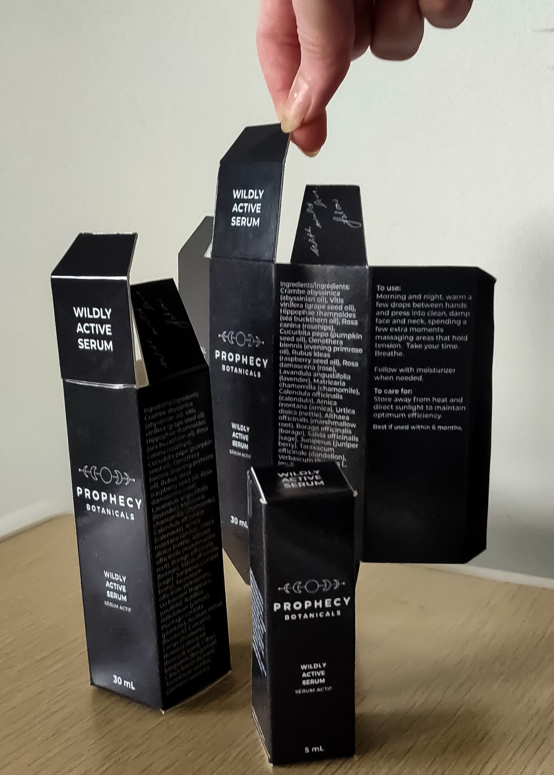
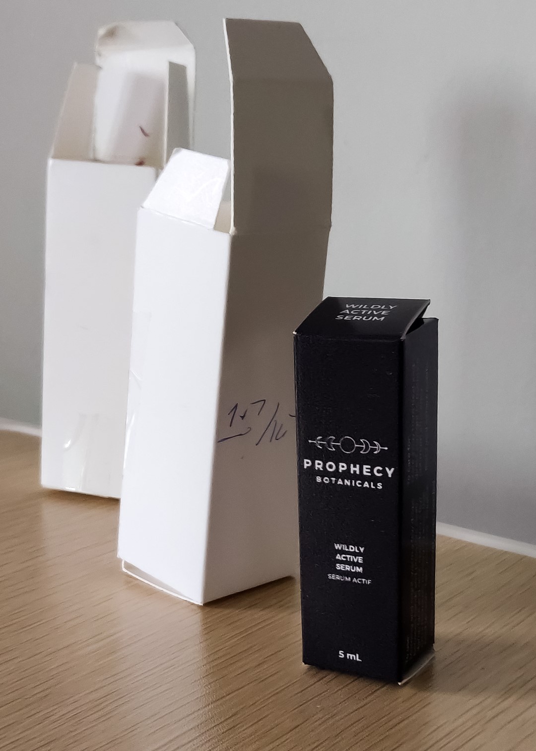
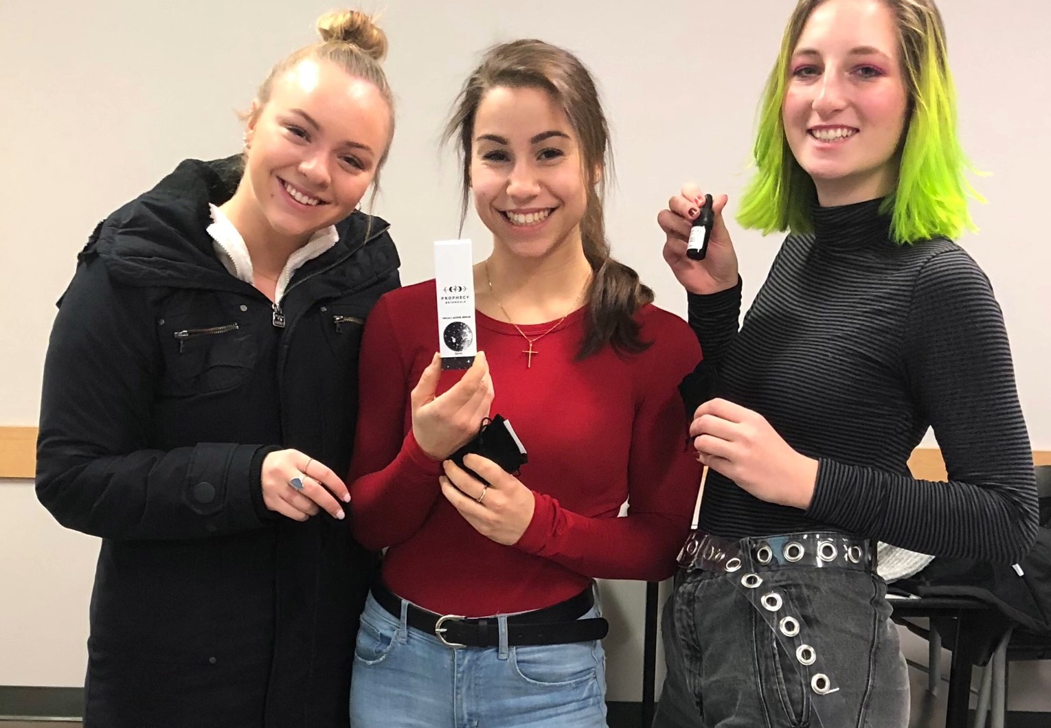
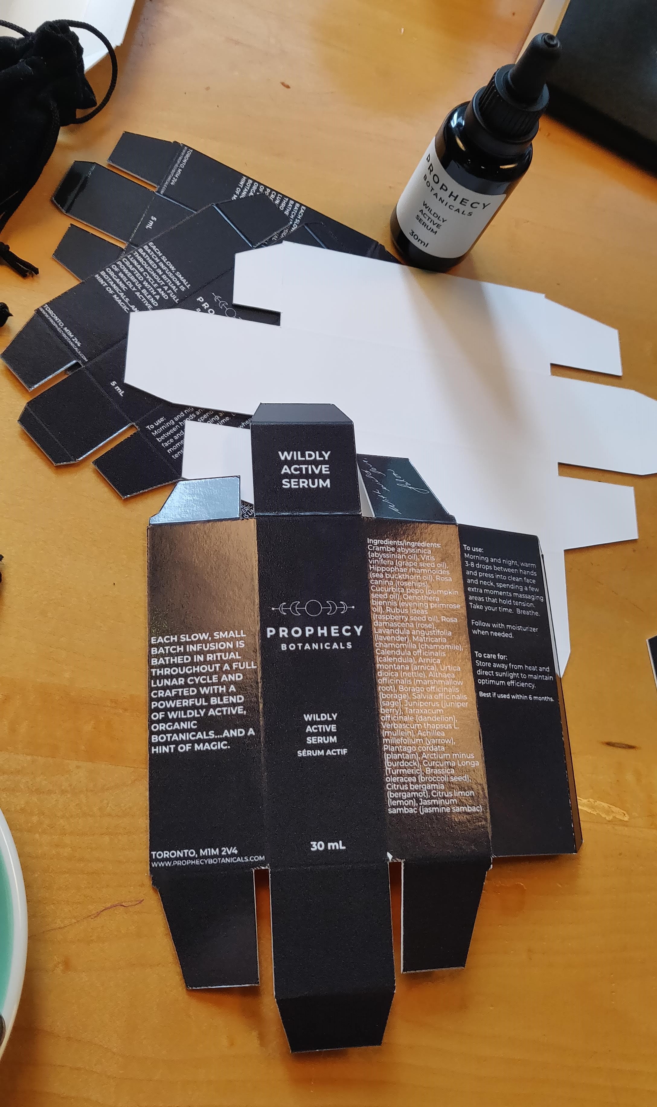
After winning first place amongst my peers in pitching concepts for another project in this course, I continued the work out of the classroom as a freelance designer to support the local cosmetic brand in creating new visuals and structures for their serum and oil product lines.
Scentso is a fictional mens cosmetic brand we were tasked with creating an e-commerce corrugated package design that would also be used for shipping. I chose this existing men's toner product to design around where I had a vision of a single sided print frame design I brought to life. Unlike the prototype, the only adhesive I intended to include was from the shipping label which would have an added purpose of further securing the frame around the product.
After our trio came in first place for a class competition designing new concepts for a local cosmetic brand, I was offered my first freelance role to continue converting this design into a saleable product following local laws and regulations.